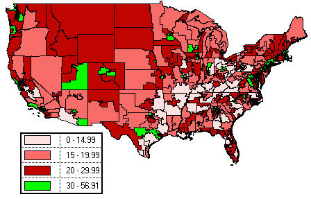
The map of the creative class

Richard Florida deserves immense credit for having written two of the most influential books of the last decade: The Rise of the Creative Class and The Flight of the Creative Class. I'll reserve a fuller discussion of the "creative class" phenomenon for a future post or series of posts on Jurisdynamics, but as an initial matter it behooves us to see where college graduates are distributed in the United States. The above map displays some radical disparities in educational background. For now, I'll be content to let the map sit atop Jurisdynamics, in the hope that it will provoke discussion, and to credit Pandagon and Tisiwoota for bringing it to my attention.
Update, Dec. 22, 2006: Here is another map showing disparities in college education by House districts in the 109th Congress, courtesy of geodemographic tools supplied by ProximityOne:


1 Comments:
This map reminds me of an article printed in the NYT this past June 13, "Flight of Young Adults is Causing Alarm Upstate." The article is about a "brain drain" from upstate NY cities like Albany, Buffalo and Rochester which have been largely stagnant for well over a decade.
While the map suggests many things about many topics, I wonder if some of the lighter shaded areas are in danger of falling into a vicious cycle (or are trapped in one already) like those Upstate NY cities along I-90 seem to be in. Businesses shut their doors, young adults leave with little incentive to return and communities begin to decay from neglect and lack of opportunity. And to the extent that these areas are unable to adapt to a changing economic landscape, what will the map look like 10 years from now?
I suspect that most lighter areas of the map will stay the same or become more pale when this chart is reproduced with the 2010 census.
Post a Comment
<< Home